


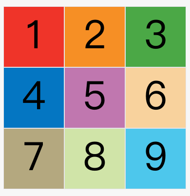
After dividing the grid, the child elements of the container will be automatically placed in each grid in order.
The default placement order is "first row, then column", that is, the first row is filled first, and then the second row is placed, which is the order of the numbers in the figure below.
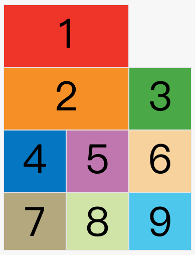
grid-auto-flow order is determined by the attribute, and the default value is row, that is, "first line, then column". It can also be set to column become "columns first and rows second".
grid-auto-flow: column;
After the above code is set column, the placement order becomes as shown below.

In addition to setting the attribute to row and column, it can also be set to row dense and column dense. These two values are mainly used for how to automatically place the remaining items after certain items are specified.
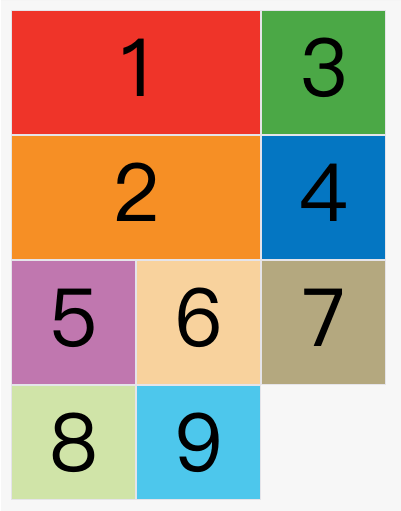
The following example makes item 1 and item 2 each occupy two cells, and then by default, the grid-auto-flow: row following layout will be produced.
In the figure above, the position behind item No. 1 is empty. This is because item No. 3 follows item No. 2 by default, so it will be ranked behind item No. 2.
Now modify the setting, set it to row dense, which means "first row and second column", and fill it as closely as possible, and try not to have spaces.
grid-auto-flow: row dense;
The effect of the above code is as follows.
The image above will fill the first row and then the second row, so item 3 will follow item 1. Items 8 and 9 will be placed on the fourth row.
If you change the setting to column dense, it means "columns first, then rows", and try to fill in the blanks.
grid-auto-flow: column dense;
The effect of the above code is as follows.

The above picture will fill the first column first, and then fill the second column, so item 3 is in the first column and item 4 is in the second column. Items 8 and 9 were squeezed into the fourth column.