


In the previous lesson, we learned how to create a grid container using display:grid property, the next step is to dive into the rows and columns.
- grid-template-columns
- grid-template-rows
.container {
  display: grid;
  grid-template-columns: 100px 100px 100px;
  grid-template-rows: 100px 100px 100px;
}
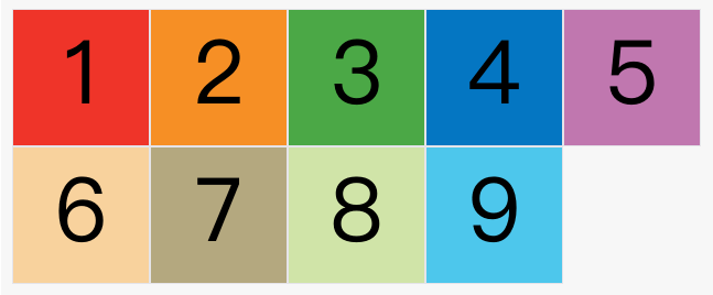
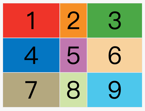
The above code specifies a grid with three rows and three columns, with both column width and row height 100px.

Instead of using absolute units, you can also use percentages.
.container {
  display: grid;
  grid-template-columns: 33.33% 33.33% 33.33%;
  grid-template-rows: 33.33% 33.33% 33.33%;
}
1 - repeat()
Sometimes it is very troublesome to write the same value repeatedly, especially when there are many grids. At this time, repeat() functions can be used to simplify repeated values. The above code can be rewritten as follows.
.container {
  display: grid;
  grid-template-columns: repeat(3, 33.33%);
  grid-template-rows: repeat(3, 33.33%);
}
repeat() Accepts two parameters, the first parameter is the number of repetitions (the above example is 3), and the second parameter is the value to be repeated.
It is also possible to repeat a certain pattern.
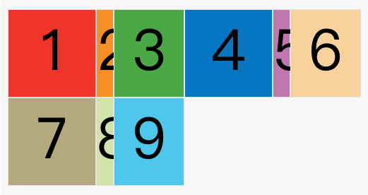
grid-template-columns: repeat(2, 100px 20px 80px);
The above code defines 6 columns:
- The width of the first and fourth columns is
100px - The second and fifth column width is
20px - Third and sixth columns is
80px.
2 - auto-fill keyword
Sometimes the size of the cell is fixed, but the size of the container is indeterminate. If you want each row (or each column) to hold as many cells as possible, you can use auto-fill keywords to indicate autofill.
.container {
  display: grid;
  grid-template-columns: repeat(auto-fill, 100px);
}
The above code indicates the width of each column 100px, and then automatically fills until the container cannot place more columns.
3 - fr keyword
In order to facilitate the representation of proportional relationships, the grid layout provides frkeywords (abbreviation for fraction, meaning "fragment").
If the widths of the two columns are 1frand respectively 2fr, it means that the latter is twice as large as the former.
.container {
  display: grid;
  grid-template-columns: 1fr 1fr;
}
The above code represents two columns of the same width.

fr Can be used in combination with absolute length units, which is very convenient.
.container {
  display: grid;
  grid-template-columns: 150px 1fr 2fr;
}
The above code indicates that the width of the first column is 150 pixels, and the width of the second column is half that of the third column.
4 - minmax()
The function generates a length range, indicating that the length is within this range. It accepts two parameters, min and max.
grid-template-columns: 1fr 1fr minmax(100px, 1fr);
In the above code, it means that the column width is not less than 100px and not greater than 1fr.
5 - auto keyword
auto The keyword indicates that the length is determined by the browser itself.
grid-template-columns: 100px auto 100px;
In the above code, the width of the second column is basically equal to the maximum width of the cell in this column, unless the cell content is set min-width, and this value is greater than the maximum width.
6 - Layout example
grid-template-columns Attributes are very useful for web page layout. A two-column layout requires only one line of code.
.wrapper {
  display: grid;
  grid-template-columns: 70% 30%;
}
The code above sets the left column to 70% and the right column to 30%.
The traditional twelve-grid layout is also easy to write.
grid-template-columns: repeat(12, 1fr);