Before learning Grid layout, you need to understand some basic concepts.
Containers and items
- The element that adopts grid layout is called "container".
- The child elements positioned inside the container using the grid are called "items".
<div>
  <div><p>1</p></div>
  <div><p>2</p></div>
  <div><p>3</p></div>
</div>
In the above code, the outermost <div> element is the container, and the three inner <div> elements are the items.
Note: The item can only be the top-level child element of the container, and does not contain the child elements of the item.
For example, the <p> element in the above code is not an item. Grid layout is only valid for items.
Rows and columns
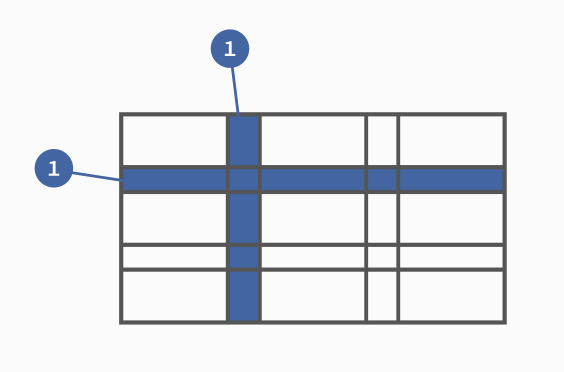
The horizontal area inside the container is called "row" (grid row), and the vertical area is called "column" (grid column).

In the figure above, the horizontal dark areas are "rows", and the vertical dark areas are "columns".
Cells
The intersection area of rows and columns is called a "cell".
Normally, n rows and m columns result n x m in cells. For example, 3 rows and 3 columns will produce 9 cells.
Grid lines
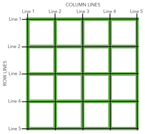
The lines that divide the grid are called "grid lines". Horizontal grid lines divide rows and vertical grid lines divide columns.
Normally, n a row has one n + 1 horizontal grid line, and m a column has one m + 1 vertical grid line, for example, three rows have four horizontal grid lines.

The image above is a 4 x 4 grid with 5 horizontal grid lines and 5 vertical grid lines.

