The first property that we can set when we implement a flex box is called flex-direction. By default this property is initialized with the value "row".
The values that we can assign to the "flex-direction" property are:
- row
- column
- row-reverse
- column-reverse
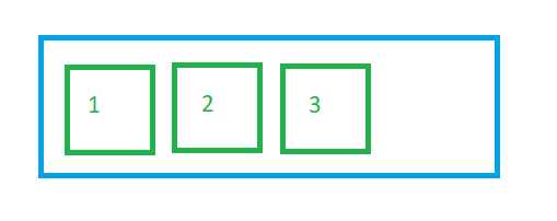
When the flow-direction property stores the "row" value, the items are placed next to each other, that is, horizontally, and the order of the items is respected (default value):

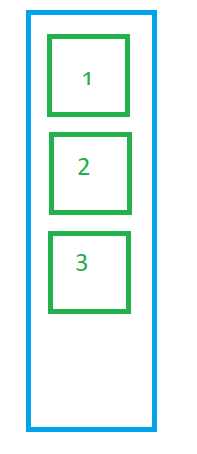
If we store the value "column" in the flex-direction property then the items are arranged one below the other:

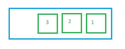
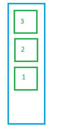
We have the possibility that the items are shown the other way around, that is, the last one is first, the antelast one is second and so on:


We can test what happens visually with each of these four values of the flex-direction property using this Javascript program:
The black space belongs to the container but the flexible boxes do not require it due to their little content. If we add more content to any of the boxes, we will see that the black space decreases or even disappears.
The page and its style sheet to obtain said result is:
pagina1.html
<!DOCTYPE html>
<html>

<head>
    <title>Flexbox: flex direction - coding180.com</title>
    <meta charset="UTF-8">
    <link rel="StyleSheet" href="style.css" type="text/css">
</head>

<body>
    <div id="container1">
        <div id="item1">item 1</div>
        <div id="item2">item 2</div>
        <div id="item3">item 3</div>
    </div>
</body>

</html>
styles.css
#container1{
  display: flex;
  flex-direction: column;
  background-color: #000;
  height: 300px;
  color:white;
  font-size:2rem;
}

#item1 {
  background-color: #0078A6;
}
#item2 {
  background-color: #0084B6;
}
#item3 {
  background-color: #008CC1;
}
If we want the flexbox to be vertical, it is necessary to assign the value "column" to the flex-direction property. When it is horizontal it is not necessary to assign the value "row" since it is the default value that the property is initialized.

