


The position of the item can be specified. The specific method is to specify the four borders of the item and which grid line they are respectively positioned on.
grid-column-start: the vertical grid line where the left border is locatedgrid-column-end: the vertical grid line where the right border is locatedgrid-row-start: the horizontal grid line where the upper border is locatedgrid-row-end: the horizontal grid line where the bottom border is located
.item-1 {
  grid-column-start: 2;
  grid-column-end: 4;
}
The above code specifies that the left border of item 1 is the second vertical grid line, and the right border is the fourth vertical grid line.
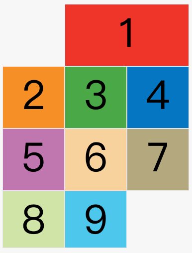
In the figure above, only the left and right borders of item 1 are specified, and the upper and lower borders are not specified, so the default position will be used, that is, the upper border is the first horizontal grid line, and the lower border is the second horizontal grid line.
Except for item No. 1, other items have no specified positions, and are automatically laid out by the browser. At this time, their positions are determined by the grid-auto-flow properties of the container.
The default value of this property is row, so they will be arranged "first row and second column".
Readers can change the value of this attribute to column, row dense and column dense, respectively, to see how the positions of other items have changed.
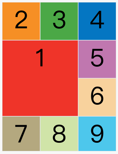
The following example is the effect of specifying four border positions.
.item-1 {
  grid-column-start: 1;
  grid-column-end: 3;
  grid-row-start: 2;
  grid-row-end: 4;
}
The values of these four properties, besides specifying the number of grid lines, can also be specified as the name of the grid line.
.item-1 {
  grid-column-start: header-start;
  grid-column-end: header-end;
}
In the above code, the positions of the left border and the right border are specified as the names of the grid lines.
The values of these four attributes can also use spankeywords to indicate "spanning", that is, how many grids are spanned between the left and right borders (upper and lower borders).
.item-1 {
  grid-column-start: span 2;
}
The above code indicates that the left border of item 1 spans 2 grids from the right border.

This has exactly the same effect as the code below.
.item-1 {
  grid-column-end: span 2;
}
Using these four attributes, if an overlap of items occurs, use the z-index attribute to specify the order in which the items overlap.